

“The purpose of this lab is to “use absolute scaling, using ArcMap’s terminology, is the proportional symbol map . . . [and learn how to] adjust the minimum symbol size for symbol scaling, specify the number of symbols to display in the legend, and create a 3-D or pictorial proportional symbol map.”
With the data set you chose, what challenged you the most when mapping proportional symbols and how did you meet the challenge? Scaling the proportional symbols based on the data from Eurostat. If I choose a scaling factor that is too small, it would be more difficult for the map reader to see patterns in the data, while if the scaling factor is too large, the map reader would be be presented with many overlapping symbols, which will also make it difficult to see patterns in the data.
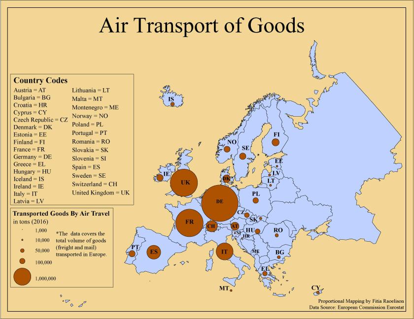
When comparing the symbolization shown on the map with the raw data (Excel
spreadsheet) obtained from the Eurostat, did your map effectively and accurately convey the underlying message to the audience? Why or why not? No, because with countries that has a value of 1,000, the size of the symbol is too small and weak for the map reader to see. However, map readers can see that Germany, France and the UK are the leading European countries with the most transported goods by air and from this information, they can assume it’s due to their advanced technologies and resources.
